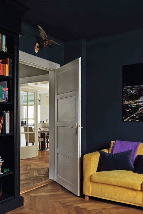
As we have writtenelsewhere, the human eye – due to its tendency to perceive colour in relative rather than absolute terms – is easy to fool.
This fact can be used to your advantage when you would like to make a ceiling appear taller.
As Farrow & Ball write on their helpful page here, the technique is to “reduce the amount of contrast between the colour on the walls, cornicing or coving and ceiling.”
The photo below shows Hague Blue being used on walls and ceiling and has the – somewhat counterintuitive – effect of making the ceiling appear taller.
We have been active users of Houzz since early 2016, and intend to expand our presence on the site during 2017.
Houzzis a trove of diverse information and inspiration related to domestic renovation and decoration – at the latest count there were almost 13m photos on the UK site, all rigorously categorised according to the rooms and styles they represent.
Even if your plans in 2017 are modest, a visit to Houzz will almost certainly repay you with some handy guidance and ideas.
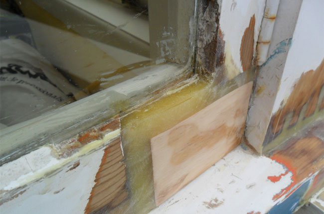
We have for some time been devoted users of the advanced joinery repair products made by Repair Care – these are the best products on the market for repairing severely wet-rotted timber windows.
The main benefit of the system is that it extends the scope of the repairs we can carry out, which can result in avoiding joinery repair costs.
With David having attended the Repair Care training course, we’re even more confident that we can make the most of these fantastic products during our exterior decorating projects.
We’re following up on our introductory post about the basics of decorating, and using colour — this week, we turn to some of the ever-thoughtful guidance in Farrow & Ball’s handsomely produced “Inspiration” A5 booklet.
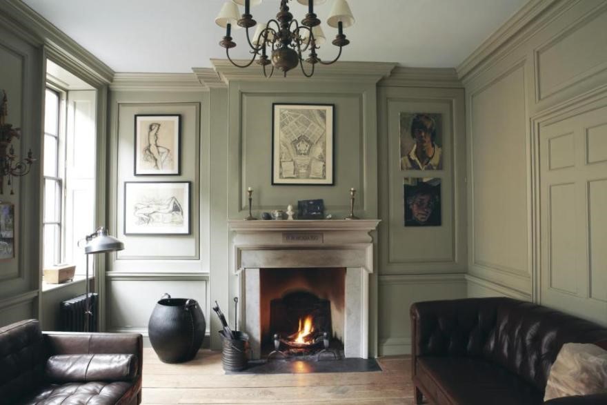
ONE COLOUR USED ON WALLS AND WOODWORK
There is great historic precedent for using one colour on both walls and woodwork and it is also popular in contemporary settings as it creates a strong, clean look.
It generates a sense of calm in a room, as well as exaggerating its size, as there are no contrasts to draw the eye.
And, as this image shows, there is indeed a calming balance to this approach — definitely an idea to consider if you have panelling of any sort in your home.
In this post — the first in an occasional series — we’ll look at some of the fundamentals of colour and contrast, to help you build a suitable palette for your redecoration.
Complementary wall and ceiling colours
One of the the most common approaches is to select a colour for the walls in a room, with white for the ceilings and woodwork. As Farrow & Ball wisely state on their website…
“Visually this is a very clean look, but it can sometimes appear harsh depending on the contrast between colours.”
Each family is made up of four shades, with colours stepped in strength to achieve a more precise shade or a simple, harmonious colour combination when used together.
So, instead of moving from the stronger wall colour to a white ceiling, the wall colour [China Clay Deep 177)] was complemented by a ceiling colour [China Clay (1)] which subtly echoed it.
Another approach is to use lighter wall colours with dark woodwork colours, something which always works well in the period homes of London. Farrow & Ball again:
“The use of a dark colour on skirting boards, not only makes the walls appear lighter in contrast, but it also creates a strong contemporary aesthetic, making everything above feel elongated and lighter in contrast.”
Something we have always observed with interest is the extent to which colours vary depending on the time of day. Take Slipper Satin, a lovely off-white from Farrow & Ball — we’ve seen its appearance vary significantly in different homes, with differing aspects and intensity of natural light.
Always use testers, and pay attention to the appearance of the colours at different times of day.
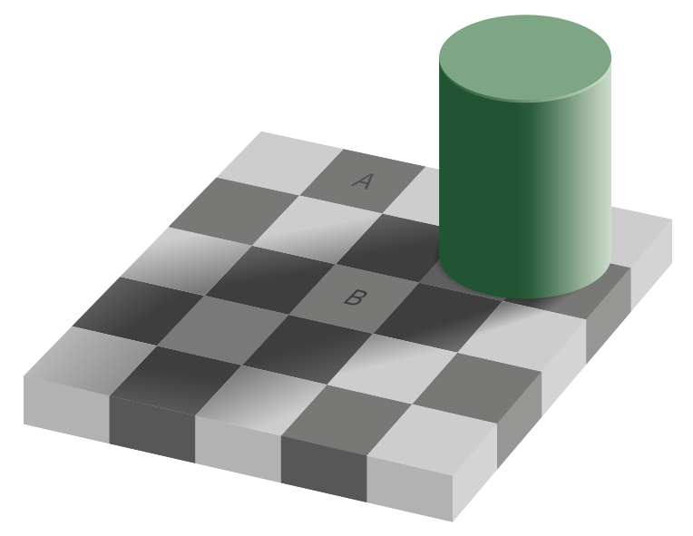
Colour perception is relative
A good lesson for painters and decorators (and their clients) to learn is that while the human eye is a triumph of biology, it is a poor absolute judge of colour.
Our perception of a colour is influenced hugely by the presence of others.
Proof of how easily our eyes can be deceived can be found in the checker shadow illusion, created by Edward H. Adelson at MIT in 1995: the areas of the image A and B are the same colour.
A working example of this rule can be found with Mono (218) by Little Greene. When Mono is placed alongside stronger colours it appears as a neutral; placed alongside whites and off-whites, it becomes an elegant blue. In effect, Mono is two colours, and how you use it will affect which one you end up with.
—
We’ll return next week with some more notes and suggestions on using colour.