In this post — the first in an occasional series — we’ll look at some of the fundamentals of colour and contrast, to help you build a suitable palette for your redecoration.
Complementary wall and ceiling colours
One of the the most common approaches is to select a colour for the walls in a room, with white for the ceilings and woodwork. As Farrow & Ball wisely state on their website…
“Visually this is a very clean look, but it can sometimes appear harsh depending on the contrast between colours.”
On one project we worked on earlier in 2016, our client — Indie & Co. — used Little Greene’s Colour Scales to create a more harmonious transition between the wall and ceiling colours.
Each family is made up of four shades, with colours stepped in strength to achieve a more precise shade or a simple, harmonious colour combination when used together.
So, instead of moving from the stronger wall colour to a white ceiling, the wall colour [China Clay Deep 177)] was complemented by a ceiling colour [China Clay (1)] which subtly echoed it.

Light walls and dark woodwork
Another approach is to use lighter wall colours with dark woodwork colours, something which always works well in the period homes of London. Farrow & Ball again:
“The use of a dark colour on skirting boards, not only makes the walls appear lighter in contrast, but it also creates a strong contemporary aesthetic, making everything above feel elongated and lighter in contrast.”

Times of day and types of light
Something we have always observed with interest is the extent to which colours vary depending on the time of day. Take Slipper Satin, a lovely off-white from Farrow & Ball — we’ve seen its appearance vary significantly in different homes, with differing aspects and intensity of natural light.
Always use testers, and pay attention to the appearance of the colours at different times of day.
Colour perception is relative
A good lesson for painters and decorators (and their clients) to learn is that while the human eye is a triumph of biology, it is a poor absolute judge of colour.
Our perception of a colour is influenced hugely by the presence of others.
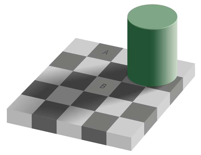
Proof of how easily our eyes can be deceived can be found in the checker shadow illusion, created by Edward H. Adelson at MIT in 1995: the areas of the image A and B are the same colour.
A working example of this rule can be found with Mono (218) by Little Greene. When Mono is placed alongside stronger colours it appears as a neutral; placed alongside whites and off-whites, it becomes an elegant blue. In effect, Mono is two colours, and how you use it will affect which one you end up with.
—
We’ll return next week with some more notes and suggestions on using colour.