We’re following up on our introductory post about the basics of decorating, and using colour — this week, we turn to some of the ever-thoughtful guidance in Farrow & Ball’s handsomely produced “Inspiration” A5 booklet.
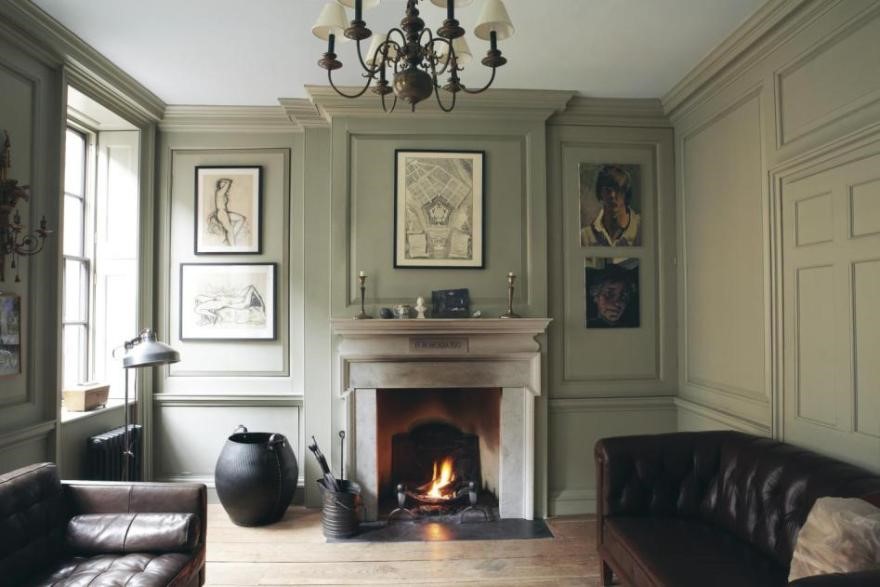
ONE COLOUR USED ON WALLS AND WOODWORK
There is great historic precedent for using one colour on both walls and woodwork and it is also popular in contemporary settings as it creates a strong, clean look.
It generates a sense of calm in a room, as well as exaggerating its size, as there are no contrasts to draw the eye.
And, as this image shows, there is indeed a calming balance to this approach — definitely an idea to consider if you have panelling of any sort in your home.